Handle Block
This is the block where you do most of your setup work for Armatures and the Handles that make them up.
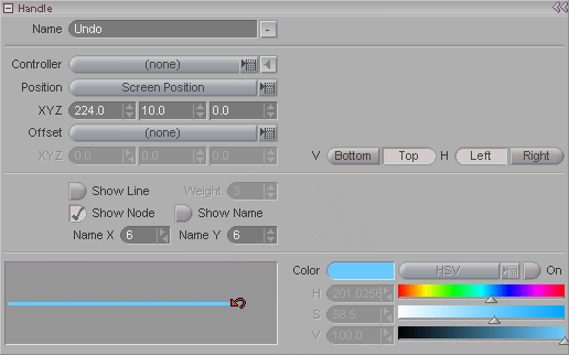
Name: Give your handle good, descriptive names so you will understand what they all do when you look at he list. Also, you can set the handle's name to be visible in the World View (which is good for making buttons), so keep that in mind.
Controller (pulldown):
Choose a controller for the current handle. You can
either use the pulldown/pop-up list, or click on the  button (the "Get Item" button) to chose the currently
selected item.
button (the "Get Item" button) to chose the currently
selected item.
What the controller is for, and what it will do is dependent on what kind of Type and Action you have set for the handle (see Action block). At a bare minimum though, the Controller is the item in your scene that the Handle is tied to in some respect. But a Handle doesn't necessarily need to be tied to a Controller. For example, if it is a Click handle, then it only needs a Controller if the Action is set to Controller Select.
Position (pulldown): Choose which type of positioning you want for the icon for the Handle in the World View. The one you choose is somewhat dependent on what type of Handle it is. For example, a button like Undo, or Item List Visibility should just stay in one place even when you change the view. But a Drag handle should move with its Controller item. There are three position types to choose from:
World Position - This puts the handle into world space, so if you move the view around, the handle will be just like any other item. It can even go in and out of view.
Screen Position - This locks the button to the screen, so you can zoom, rotate or move the view in the World View but the handle icon will stay where it is.
Parent Handle - This will parent the handle to its parent handle (not to the controller item). For example you might have a drag controller to move an item around, but have a hidden handle that will appear when you right-click on that handle. The handle that appears might have some additional functionality, so you would want it to appear next to the drag handle.
XYZ: When the Position is set to World Position or Screen Position you can use these controls to move the icon to where you want it in the World View. (You can turn on Realtime Modify at the top of the Armatures block and just drag it to where you want.)
Offset (pulldown): This lets you offset the position of the handle icon. When you lock a handle to a controller, the handle will snap to the controller's origin (or pivot point). But often that isn't preferable because it can be hard to select, since the origin is also where the center of the Edit Sphere is. Or you just might want to move it off to the side so it's easier to see and grab. This pulldown lets you choose which type of space to offset in. Besides "none." the choices are:
Pixel - Uses the screen as the coordinates. So moving it up/down on Y will move it up/down on your screen no matter how the World View is rotated.
World Space - Uses the layout of the world. So moving it on Y will move it up and down on the Y axis of the World View grid, which might not match the up and down of your screen, depending on how (or if) the world is rotated.
Local Space - Moves it in regard to its controller object. So if the controller object is tilted, moving the icon on Y will move it up and down the tilted Y axis of the controller object. Think of it as matching the axis lines on the controller object's Edit Sphere no matter how that Edit Sphere is oriented.
XYZ: Use these controls to adjust the offset of the handle's icon after you have selected the Offset type (above).
V Bottom/Top: When the Position pulldown is set to Screen Position, use these to lock the handle icon to a portion of the screen. If you set it to Bottom, then it will move up or down as you drag the Motion Graph divider up or down. It will, in other words, lock to that divider. You would use the Bottom setting if your icon is near the bottom of the screen and you wouldn't want it to get covered up when you drag the Motion Graph. If it is set to Top, it locks to the top of the screen. You would set it to Top if you don't want the icon to move at all when you drag the Motion Graph divider up and down. For example, the Coord Sys handle at the bottom right of the World View is set to Bottom, so it moves with the Motion Graph. The black arrow icon for the view settings a the top of the World Veiw is set to Top, so it doesn't move.
H Left/Right: When the Position pulldown is set to Screen Position, use these to lock the handle icon to the left or right of the screen. If you set it to Left, then it locks to the Item List divider, so if you make the Item List wider or narrower, the icon will move with it. If you set it to Right, it will not move at all when you drag the Item List. For example, the Coord Sys handle at the bottom right of the World View is set to Right. The black arrow icon for the view settings at the top of the World View is set to Left, so it will move with the Item List.
Show Line: If you want, you can have a line connecting an armature hierarchy. This can sometimes be useful for grouping things or to show a layout (like making a stick figure out of handles, where the handles will select that part of the character).
Weight: Sets the thickness of the line.
Show Node: Choose whether you want the handle icon to be visible. When the node is hidden, it will also not draw its line.
Show Name: Lets you have the handle's name show up in the World View. This is extremely useful for making certain kinds of buttons (look at he Coord Sys button) and, naturally, for letting you know what all those icons do. You can even make handles where you hide the line and the node, so all you have is the name. This is great for making on-screen instructions or reminders.
Name X, Name Y: Use these controls to position the name in relation to the icon. The Coord Sys icon at the bottom right of the World View is a good example. That is an armature handle, not a native messiah button. It is part of the Basic Screen Controls armature. The name is turned on and positioned over a button shaped icon.
Line & Icon window: This window shows what the line and icon are for this handle. It is also where you choose the line style and icon. To choose the line style, click on the line and you will get a pop-up with the different styles available. Double-click on the one you want. The same goes for the icon. Click on it and the icon selector tray will pop-up. Choose the icon that you want and double click on it. You can scroll with the scrollbar or with your mouse wheel.
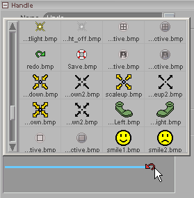
Click on the icon to bring up the icon selector tray. Scroll the tray using either the scroll bar on the left, or your mouse wheel. When you find the icon you want, double click on it to apply it to the current handle.
Note: You can make your own icons. Just save them out as BMP (bitmap) files and put them in the messiah\modules\defaults\icons folder. White is the transparent color, so if you want something to be transparent, make it pure white (RGB: 255,255,255).
Color Picker: Turn this on if you want to customize the color of the line and name for this node (assuming you have the line and/or name set to be seen in the World Veiw).
| Converted from CHM to HTML with chm2web Pro 2.82 (unicode) |